WorkReady Classroom
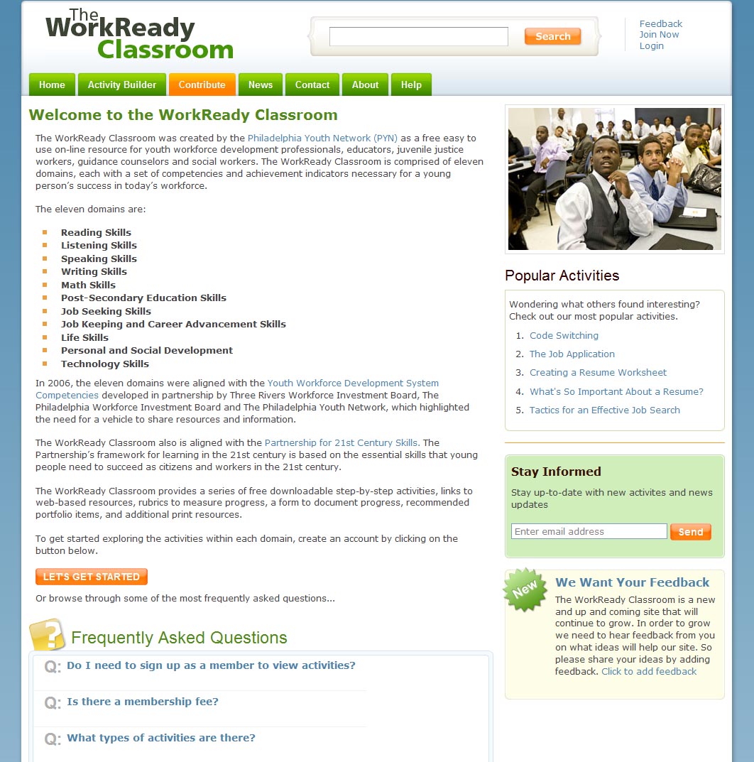
The WorkReady Classroom was created by the Philadelphia Youth Network (PYN) as a free easy to use on-line resource for youth workforce development professionals, educators, juvenile justice workers, guidance counselors and social workers.
Programming and Features:
HTML, CSS, Logo Design, Javascript, PHP, MySQL, SEO
10 Website Essentials to Increase Your Sales
If you are a serious Internet Entrepreneur, your top priority must be your website. Your website is a direct reflection of you and your business. Creating a professional website designed to sell will take a great deal of time and effort, as there is much more to take into consideration than design. You must look at a much broader picture and specifically design your website to sell.
1. You must have a professional looking website. Your website is the most important sales tool you have. Your visitor’s first impression will almost instantly determine whether or not you’re going to make a sale. A professional website should be pleasing to the eyes, well organized, easy to navigate and load quickly.
2. You must specifically design your website to rank high in the Search Engines. This involves much more than just including META tags. Your KEYWORDS, TITLE, IMAGE ALT tags, Text and overall design, all play an important roll in determining how your website will rank.
3. You must use effective sales copy. Your words are the entire foundation of your business. Most business failures are the result of ineffective copy. Whether it is your website, sales letters or advertisements, your words play a major role in determining your success. When writing your website copy, use the following formula:
A -Attention – Use a powerful headline that demands attention
I -Interest – Intrigue interest and create curiosity
D -Detail – Provide details about your product or service
A -Action – Call for action
4. Drive traffic to your site. In order to create a steady stream of traffic to your website, give your visitors a reason to visit and continue to visit in the future. You must provide your visitors with fresh content on a continual basis. Content comes in various forms, such as news, articles, tips, horoscopes, weather, etc. and is freely available on the Internet. Your content should blend in well with the focus of your website and be updated on a regular basis.
5. Provide free instruction. Your website is the storefront for your product or service. You must convince your visitors that they need the product or service you’re offering. This can be accomplished by providing your visitors with free helpful advice and instruction in the form of an article, tutorial, free ebook or free autoresponder course.
6. Display your testimonials. You must gain your visitors trust. By displaying customer testimonials, you are boosting your potential customers confidence in you and your product or service. You can either create a web page to display all of your testimonials or use a script to rotate them on your main page.
7. Let your visitors know who you are. Provide complete information in regard to your company including, address, phone number and email addresses to request information and support.
8. Tell your visitors about their privacy. Create a page on your website called, “Privacy Statement,” and let your visitors know exactly what you do with the personal information you collect.
9. Provide a sample or trial of your product or service. For example, if you’re offering a Search Engine optimization service, provide a free META tag analysis at your website. Not only will this increase your sales, but it will drive more traffic to your site as well.
10. Remove the risk. To further increase your sales, you must remove the risk by providing a guarantee. A guarantee will boost your potential customer’s confidence in purchasing your products or services.
A professional website specifically designed to sell is one the most important factors in determining your success. Take your time and make sure you’re looking at the complete picture before you begin. If you’re not secure in your abilities to create your own website, rather than risk the potential success of your business, consider hiring a professional web designer. Your success depends on it.
Top 10 Business Website Mistakes
Today it takes more than just having a Web site to make the Internet work for your company. Sites are highly competitive, and proper site design has become an area of concern to businesses that want to use the Internet to the fullest. Below are 10 common Web site errors that occur.
1. Inappropriate domain name: Pick a domain name that is memorable and relates to your business. Since people are likely to forget very long names, shorter domain names are typically better, but not always. For example, a name like Peter.com can be too vague and says nothing about the content of the Web site.
2. Poor design and functionality: Why have a Web site with content if no one can access it? Good design is largely based on consistency. Menus should appear in the same place on every page, links should all be the same color/typeface, and a logo of some sort should be clearly visible at all times.
3. Too complicated or too slow: Although flash animation may look amazing, it may be too complex for casual Internet users. Though aesthetics certainly matter, it must be in balance with functionality and ease of use for the typical user. Also, a more complex design takes longer to load on many computers.
4. Stagnant site: Not only is content time-sensitive, so is format and design. There will always be new tools available to make Web sites better looking and better performing. It is not cost-effective to create a Web site and let it sit. Update content regularly and take advantage of (appropriate) new technologies to make the site look better.
5. Broken links and 404 error messages: Make sure every link on your site works. You’ll lose users quickly if they see a “404 file not found” error message or find broken or incorrectly labeled links. If you have a large site, consider adding a form so users can submit a broken link, which lets users know you are on top of any problems they discover.
6. No contact info: Users need to be able to contact you with questions, complaints, and suggestions. A Contact Us page, like an Internet business card, should be available from any part of your site. Also, be sure to actually answer these messages either personally or through an auto-reply.
7. Ignoring statistics: Detailed reports of visitor traffic are available for your Web site. This service may be offered by your hosting provider or obtained through a third party. By monitoring your statistics (such as visitors-turned-customers, users on broadband, etc.) you can tailor your marketing and design toward those who visit most or find weak spots based on who you are not attracting.
8. Free or cheap hosting: As attractive as some of these services are, realize that the reliability of your business depends on the reliability of your hosting. A good host service should have minimal downtime, offer services such as shopping cart systems, and have good customer support. Be sure to read reviews and apply for free trials (if possible) before you commit to anything.
9. Avoiding spiders: Spiders are what search engines use to find your page. You want to make sure your pages are designed so that you show up high on search engine rankings. This process is called search engine optimization. There are, however, ethics and strategies to SEO. Some practices (such as hidden text, redirects, etc.) will result in you being banned from search engines.
10. Not hiring a professional: Search engine optimization is complex. To move up in the listings on Google and other search engines, you may want to hire a professional, especially if your business relies heavily on generating business from the Web.
Contact me today and see how I can help with your next project.
Eight Top Website Design Issues
Does your Web site keep people captivated, or does it send them fleeing as soon as they get to your home page? Do you offend your visitors with the following annoyances?
1. Automatic audio. Always give people the option of listening to any music or recordedinformation you have on your site. Don’t automatically assume that your visitors will be captivated by your voice or your music. Always give them the option of turning it off.
2. Spinning, flashing, or blinking ads. Flashing banner ads are the equivalent of a carnival barker trying to lure people into a sideshow. You don’t need to shout to people to get you message heard. Keep you ads limited and your content abundant.
3. Unnavigable sites. Do not expect visitors to jump through “link hoops” to get to your information. They won’t. Make your product, price, or service, clear, precise, and easy to find. Design your content so that even elementary school children can understand your site.
4. Excessive pop-ups. In this day and age, pop-ups are inevitable. But if visitors have to close multiple pop-ups to get to your site, they may leave and never come back. The same applies for “fly-in” or “hover” that bounce across the screen. If you have to use anything, incorporate a pop-up that loads when a visitor leaves your site.
5. A page full of dead links and 404 error messages. Keep your links up to date and take down the links that are no longer active.
6. Dark text on a dark background. Don’t expect your readers to work to read your content, because they won’t. They will leave and find the information they need elsewhere.
7. Use Flash judiciously. Unless you have a film site or a product that requires a detailed visual description, resist using Macromedia’s Flash for e-commerce. If you are using your site to sell a product, use high-quality, fast-loading photos and creative descriptions of each item. If you must use Flash, make your files as small and fast-loading as possible.
8. Solid blocks of text with no breaks between paragraphs. That may work in print, but it will not fly on the Web. People don’t read online content the way they read offline — they skim. Imposing blocks of dark text will put off your readers. Make your content clear and concise. Break up your paragraphs, and use plenty of white space.
If your site makes any of the mistakes enumerated above, it is not too late. Make the necessary changes as soon as you can. In fact, if you haven’t redesigned your site in the last 6 to 12 months, you may be due for a redesign anyway. And make sure that when you do redesign that you don’t fall afoul of any of these rules.
Develop an Effective Small Business Web Site
The best Web sites are those that serve the purpose of their owners. For some businesses, a Web site provides the backbone of the company’s retail operation. For many other companies, the site offers an adjunct source of sales revenue along with their brick-and-mortar operations. Some businesses use a Web site primarily for promoting their products or services and keeping their name in front of the public.
No matter what the use will be, it is generally a good idea to look at other Web sites to get an idea what you feel would work best for your business. Look at each site with a critical eye.
Ask yourself:
- Do I like the layout?
- Is there a logic to the sequence and the information?
- Is the site easy to navigate or am I clicking repeatedly to find what I’m looking for?
- Is the site current?
- Are products and/or services clearly displayed?
- Is the sales checkout process simple and quick?
The best Web sites are user-friendly, easy on the eyes (visually appealing), entertaining, informative, and current.
Some site planning and Web page design tips include:
- Less can be more, so don’t overcrowd a Web page.
- If you are selling items, make sure your product photos are large enough to see clearly. Try to illustrate the key features.
- Title each page so that they are easily located by the user and by search engines.
- Make each page easy to navigate.
- Try to be concise with text. You can always have readers click to get more information.
- Make the home page the center of activity. Make sure it is always easy to return to. Clearly define the purpose of the site and create an image on your home page.
- Provide customer service, phone numbers, and contact information that clearly illustrates an accessible business behind the site.
- Make sure the color of your text is easy to read against the background you’ve selected. Experiment with different colors to see which creates the best presentation.
- Double-check all links often to make sure they work.
- Don’t get caught up in “bells and whistles.” Just because the software, Web designer, or Web-hosting service allows you to include a myriad of features doesn’t mean you need them.
- Make sure the site loads quickly. Don’t let graphics slow it down.
- Be diligent about copyright usage and make sure you have the rights to all information you are posting.
Besides dotting the i’s and crossing the t’s, so to speak, you not only want to make sure your site looks good and works properly, but that it best represents your business. Also, keep in mind that you need to promote the Web site. Unlike the line in the movie Field of Dreams, “If you build it, they will come,” a Web site will not attract visitors unless you register with several search engines and promote the site on all company literature, with all sales, and on all advertising and promotion pieces.
Making your Website Memorable
To do this you must make your site and company stand out in your prospect’s mind. Design your website to impress your visitor, because as with an offline store, first impressions are lasting. People come to websites for information and they may not necessarily be interested in what you sell when they first come, so you need to keep them coming back with the following …
- Design your website to impress
- Informative content to make your visitor think
- Product and book reviews that will pique curiosity.
- Hot in demand product and service
- Simple navigation to draw them into your site.
- Good small graphics aimed to entice.
- Fast loading pages
- Nicely presented font and coloring that does not take concentration away from your content information
- Good sales copy
- Free newsletter
Information is the number one reason for visits to s site. People want to know all about a product or service before they spend their hard earned money. Give your visitors what they want and write some good informative information about your product or service. This can be in the form of info articles, product reviews or testimonials, to name just a few.
Of course your product or service should be in hot demand and fulfill your potential customers wants and needs.
Simple navigation is a must. Have you ever been to a new grocery store or department store and been completely overwhelmed and not know where to find anything? Do not make your visitor feel that way. Make your navigation simple and straightforward so that even a child could find their way around.
Graphics can often enhance your product but be careful to make them small and professional. If they do not greatly enhance your product do not use them. Be careful of fancy flash designs. These can slow up your website and cause visitors to leave. It is critical for your business to have a fast loading site.
Do not use unique fonts and bright colors. Remember you are operating a business site and as such should keep it clear and professional at all times. Do not do anything that will take away your visitor’s concentration from your information and sales message. Black font on a light background is good, with one other color for emphasizing points. Times Roman, Veranda, or Ariel are good fonts to use. Size 12 font is easy to read for the average reader.
Lastly but most importantly be sure that you have a strong pulling sales page. This is the key to your business success. Without a good sales page you cannot sell even the hottest products and services. Your sales copy must be personal, persuasive, precise and professional. If necessary have one written professionally you will make back your investment with your first few sales.
Do not forget to offer your visitors a free newsletter. You will capture the prospects that are not quite ready to buy and you will build a targeted business list of interested potential buyers, who will very likely buy one or more of your products or services in the future.
Make your website irresistible and above all memorable. Entice and encourage your visitors to remember and return to your website. Do you remember that great store you loved so much that you returned and bought from them over and over again? Make your website the favorite cyber store for your products and services by impressing your visitors and making their visit to your site memorable.
I would be happy to review your website and work with you to make improvements to increase sales and traffic. Contact me today
7 Essential Conversion Techniques
On average, you have roughly seven seconds to get your message across before the end user abandons your website for one of your competitors’ sites. We have created simple guidelines for what should—and, more important, should not—be featured on your homepage, so that you can convert regular traffic into revenue.
1) Create a Powerful Homepage Message.
Your homepage message should be a targeted, benefit-oriented statement that outlines what you can do for the potential customer. In order to properly draft an intriguing homepage message, you will need to identify the inherent benefit to your potential customer base.
No one wants to hear that you are “the best”; customers want to hear why your product/service is different and what it means to them. Put more simply, customers are asking, “What can you do for me?” Answer them.
2) Focus on Clarity.
These days, with so many people searching online for products and services, your homepage should clearly identify who you are, what you offer, your core competitive benefits, and your supporting text—all in a clean and easy-to-navigate user interface. Use graphics and pictures to help illustrate what service or product you provide, and how these benefit the customer.
However, the homepage should be a “no-fluff” zone. A good rule of thumb for the homepage is “less is more.” Make it easy for the user to understand what you do. Too much verbiage, images, and graphics will only confuse the user. White space, good. Clutter, bad!
3) Make Effective Use of “Secondary Messaging.”
After you have presented your homepage message, you will need to incorporate “secondary messaging” on the homepage. This includes any additional messages that will be used to help clarify and drive home the points made in the primary message.
Secondary messaging should also incite the user to take certain steps—that is, it should be a call to action. These calls to action could direct the user to e-mail the company for additional information, phone the sales rep, download a white paper, read a recent success story, etc. A good marketer will know how to choose a penetrating secondary message.
4) Integrate Imagery and/or “Flash” to Emphasize Your Core Message.
Imagery and flash animation are important parts of your homepage. To help illustrate your company’s core competitive benefits, both strategies help customers visualize how you can meet their needs and requirements. Most people are visually oriented, so your imagery/flash will quickly convey and emphasize your message.
Be consistent with what you are telling your potential prospects. Align your messaging with your visual strategies. Images and flash are also great ways to eliminate clutter; by adding a visual component to your website, you are alleviating the need for additional reference text.
5) Drive Toward a Specific Call to Action.
You have already heard a little bit about calls to action, but it is such an important strategy that we have also dedicated a specific section to it. Failure to convert online potential customers into sales leads is mostly attributable to homepages that lack primary and secondary calls to action.
A call to action can be as simple as a link that states, “Contact us for more information” or “Tell us more about your needs and we will schedule a conference call.” Statistics have proven that if you can guide web users along your sales process, you will convert more of them into customers.
6) Know Your Audience, and Know the Audience Within Your Audience.
OK, so maybe you don’t know who Carl Jung is, but chances are, you either have taken or soon will take a Myers-Briggs personality test. Most people can clearly state whether they are an introvert or an extrovert; your website should cater to these and other personality types. Develop your website not only for an audience that requires what you can provide, but also for disparate personalities within that audience.
Some people prefer to pick up the phone to find out more information about your products or services. Some may prefer to e-mail you instead. Others may want to schedule a meeting. Your website should cater to as many of these personality types as possible, or else you will lose conversions. Make it easy for the web user to contact you . . . using whatever method they choose.
7) Make Your Homepage Easy to Navigate.
You must lay out your website with easy-to-navigate options and buttons. If you are a service-based company, then put an “XYZ . . . Services” tab on the top navigation bar. If you sell more than one service, then enable a pull-down menu showing options for your customers. Allow them to select the page that they want to research—without having to click first to find out more (a big no-no!).
Another strategy is to use sidebars to help users navigate as they read your content. You will also need to ensure that your homepage uses an interlinking strategy, so that if web users hit the wrong button, they can easily get back on track and find the information they seek.
The Bottom Line
Make it easy for a prospect to find out more about your products and/or services. Create a homepage that takes the guesswork out of it by guiding web users through the process, from understanding the message to taking action. Statistics have shown that the more clicks it takes for potential customers to find what they seek, the higher the rate at which they will abandon the website.
These guidelines will not only create a more satisfactory website experience for the end user, but will also convert some of that scrolling web traffic into genuine sales leads. And as we all know, the more sales leads, the more $$$. Give your website the much-needed attention it deserves. Your website should be your company’s most effective marketing tool.
Gibson Heating & Cooling
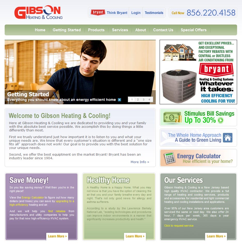
Ken Gibson, of Gibson Heating & Cooling, requested a website for his new business in HVAC. Created a website that gave a wealth of resources to educate consumers on HVAC and ways they can reach Ken for service or questions.
Programming and Features:
HTML, CSS, Javascript, PHP, MySQL, SEO
The Apple Tower

Brian Barnett, a talented cartoonist, requested a website where he could take his comic strips and display them for all to see on a daily basis.
Working with Brian was such a pleasurable experience that it made the project a memorable one. We both knew he would need a full custom CMS to handle all the features he wanted to provide to his audience. Some of the other features on the site include: a section that is interactive and you can point to characters and meet them through a description of each. You can e-mail Barnett through the site or send it to a friend. There is even an area where you can buy Apple Tower merchandise, shirts, coffee and travel mugs, shirts, bumper stickers, mouse pads, and more. A Coffee Shop section is a forum which allows you to enter your thoughts about the site. There is an archive where previously posted cartoons appear.
Programming and Features:
HTML, CSS, Javascript, PHP, MySQL, Custom CMS, SEO
Jim Westhoff
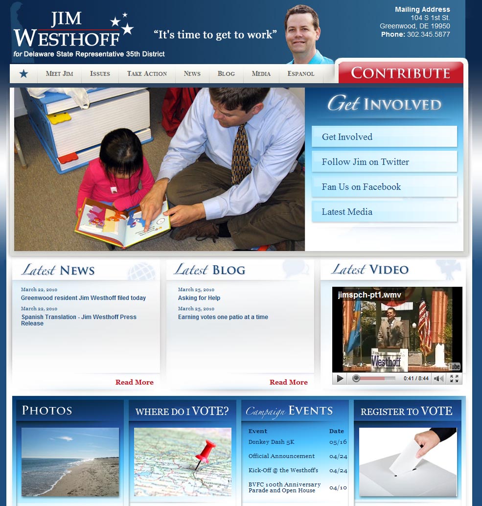
Jim Westhoff of Greenwood, Delaware requested a political campaign website where he running for Representative of the 35th District.
Programming and Features:
HTML, CSS, Javascript, PHP, MySQL, Custom CMS, Logo Design, SEO